Sometimes big things take a little planning
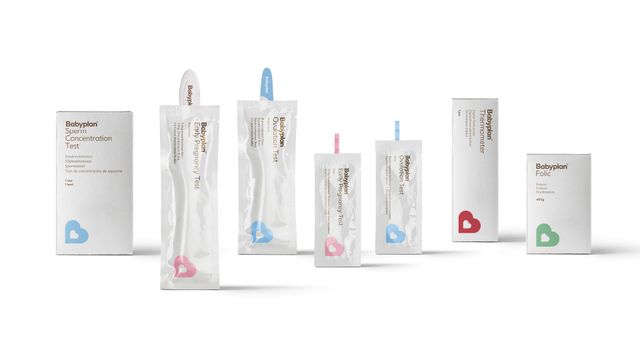
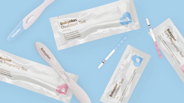
Babyplan is one of our long-term partnerships. Through ongoing collaboration, we redesigned the graphic identity, optimised the company’s online presence, as well as creating a complete design of their product packaging range of fertility-related products. As an e-commerce company, Babyplan creates and distributes fertility products, from pregnancy tests to at-home ultrasound machines – all of which aim to ensure a more stress-free and positive family planning experience. AM’s mission was to reflect Babyplan’s manageable and encouraging approach to an oftentimes strenuous situation, with a hearty and yet professional graphic appearance.
The idea
In most cases, at-home treatments and product design contain an extensive and pretty overwhelming amount of information in their visual appearance. AM wanted to counteract the complicated and frustrating processes by providing Babyplan with a fresh and mindful identity, product packaging, and digital design. The aim was to reflect Babyplan’s ambition towards making the process of getting and being, pregnant more enjoyable and optimistic, through a smooth and uncomplicated design.
The result
The outcome of our partnership is a clean, fresh, and positive design for Babyplan’s website and product packaging. The design included creating a brand architecture system with an easy-to-use colour categorization scheme for the products, which would make each of them easily identifiable for customers by separating them into function, type, and her/him usage. It also includes the redesign of Babyplan’s logo with its multi-faceted interpretations. It can either be viewed as merely a tilted B, a heart within a heart, or a child within a womb – all of which emphasize Babyplan’s kind-hearted ambitions and hopes for their customers’ ideal pregnancy journeys. Sometimes big things require a little planning.
Got a similar project? Reach out to Søren


