Redesigning Democracy
The aim for our project with Dansk Ungdoms Fællesråd (Danish Youth Council) was to create a unifying graphic identity for a diverse organisation. Dansk Ungdoms Fællesråd, or DUF, works to engage the younger generations in the Danish democracy. Since DUF encompasses various organisations, our aim was to unite all of them in one collective graphic identity.
The idea
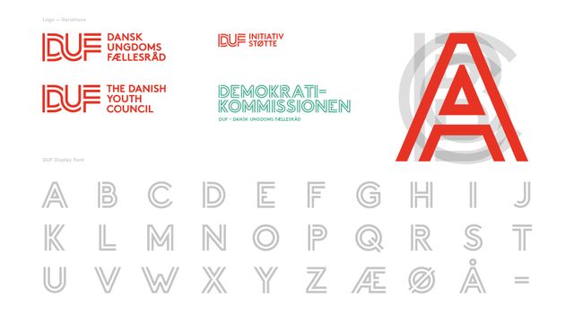
The idea came to be from reflecting upon the traditions and activities within a democracy. Back in the days, when people went on the streets to fight for their rights, they brought their own banners. These had the unique quality of uniting several people through shared beliefs. One thing, which all of DUF’s organisations has in common, is their foundation in Denmark and in the ideas of the Danish democracy. So what could be a better inspiration for a custom typeface and the overall identity than the Danish flag? Looking back at DUF’s previous logos we discovered the occurrence of the same inspirational source – so we decided to revitalise it into a new and exciting graphic identity.


The outcome
After a workshop surrounding DUF’s heritage, challenges, and vision, AM presented a variety of ideas and solutions with the potential to embrace the democratic nature of the organisation. The old logo was transformed, redesigned, and reinvented into a complete font which was then used on the organisation’s website, as well as on posters, banners, leaflets, and much more. By designing a unique custom typeface, DUF was handed a useful and innovative tool for communicating across all branches of the organisation on a day-to-day basis.


